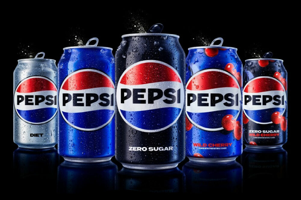
PURCHASE, NY. — PepsiCo, Inc. is updating the Pepsi brand’s visual identity and launching a redesigned logo, the first change to its logo in 14 years.
Featuring a bolder typeface and a modernized take on earlier iterations of the Pepsi globe, the logo will be used across all the company’s physical and digital outlets, including packaging, merchandise and fountain equipment. The revamped look also utilizes black font intended to convey the brand’s focus on its zero sugar products.
“At PepsiCo, we design our brands to tell a compelling and holistic story,” said Mauro Porcini, chief design officer and senior vice president for PepsiCo. “We designed the new brand identity to connect future generations with our brand's heritage, marrying distinction from our history with contemporary elements to signal our bold vision for what's to come.”
To improve its flexibility for use across physical and digital marketing spaces, Pepsi’s logo also includes a pulse graphic that creates a visual sense of movement and animation.
The redesign is set to roll out in North America this fall as part of the brand’s 125th anniversary, and a global launch is expected in 2024.
“Pepsi is an iconic brand that is constantly evolving with the times, as it has been a staple in pop culture and disrupted the category for the past 125 years,” said Todd Kaplan, chief marketing officer for Pepsi. “We couldn’t be more excited to begin a new era for Pepsi, as this exciting new and modern look will drive brand distinction to show up bigger and bolder and help people find new ways to unapologetically enjoy the things they love. This new visual system brings out the best of the Pepsi brand’s rich heritage, while taking a giant leap forward to set it up for success in an increasingly digital world.”